Vanguard Careers
Vanguard Careers
Vanguard Careers
Vanguard Careers
Vanguard Careers
Vanguard is a global company in financial and investment management. In this project, I improved how job seekers connect with Vanguard by modernizing the careers site and making it easier to explore roles.
❗ Problem
The old careers site:
Didn’t match Vanguard’s current brand style
Made it hard for users to find up-to-date, relevant job info
Created confusion and missed opportunities for job seekers
✅ Solution
Redesign the entire careers site experience, while also developing a design system that could support future updates and better site management.
Approach:
Improve how people find jobs
Make the experience feel modern, clear, and aligned with Vanguard’s brand
Build reusable components for scale and consistency
💭 Identifying Gaps & Opportunities
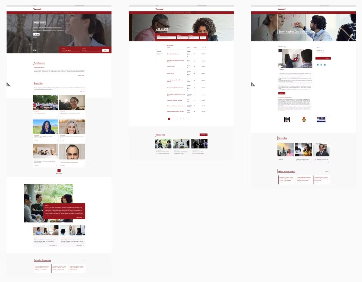
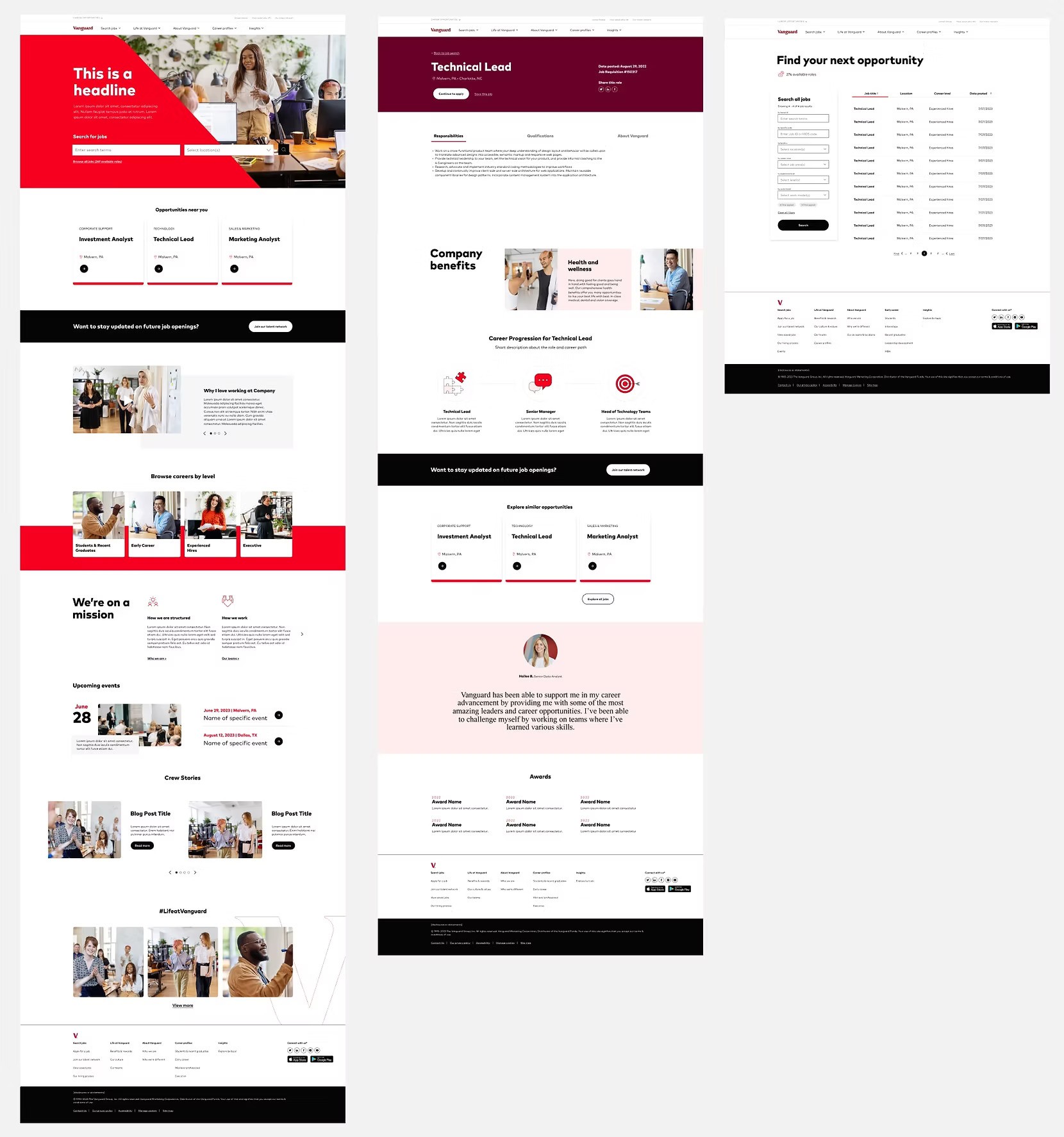
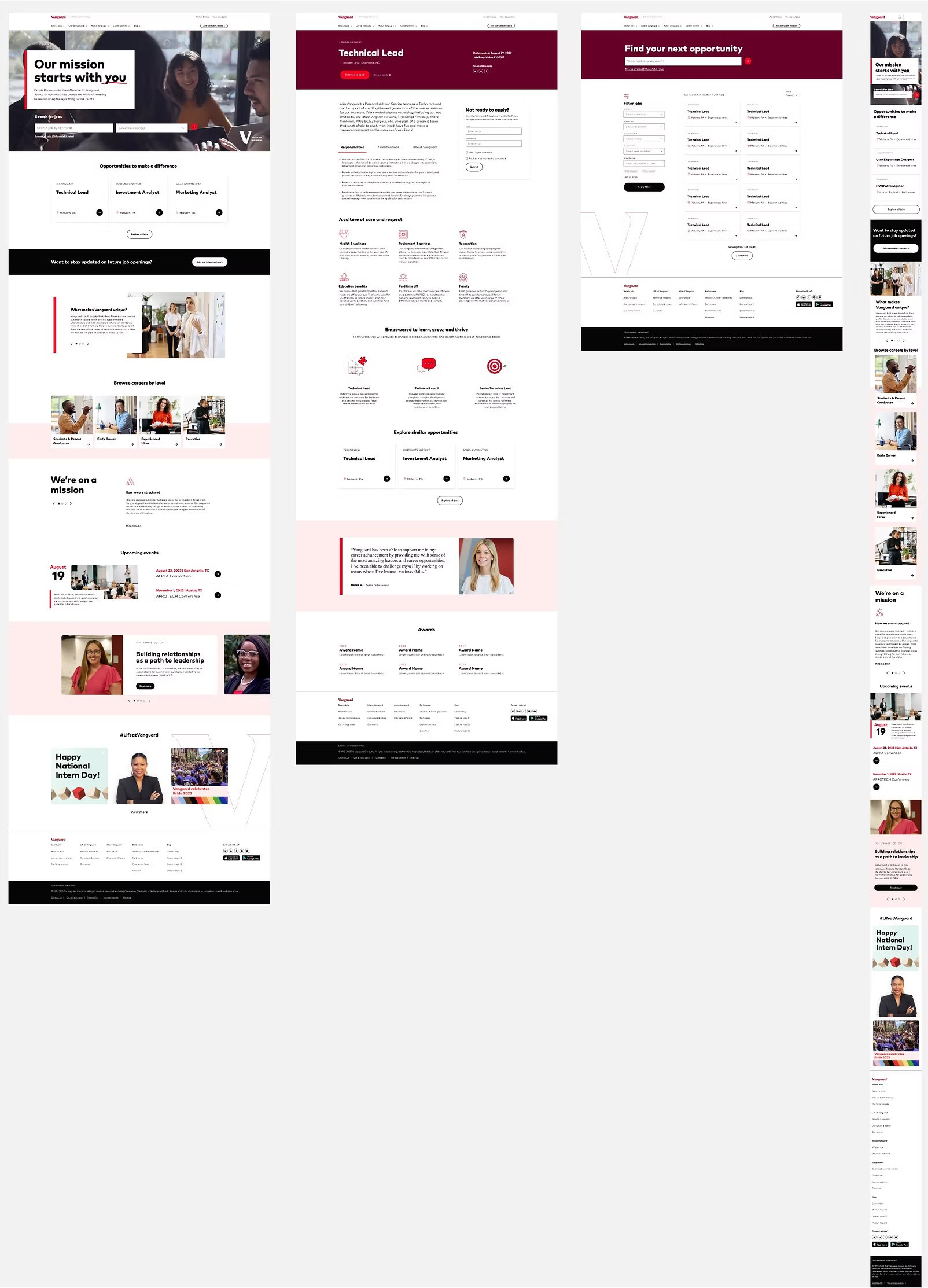
Original Vanguard career site: homepage, job search page, job description page (left to right)
📐 The Process
Discovery & Research
To understand user pain points and business needs, we started with
A full site audit
Competitive analysis of 27 career sites
Internal reviews of Vanguard’s design system
Tree testing to assess the site’s current navigation
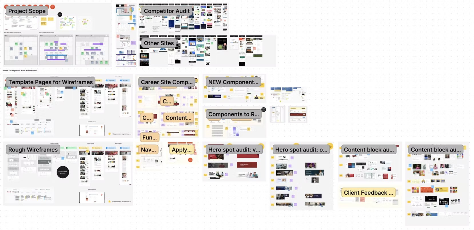
FigJam analysis and audit board
Key Findings
The design felt disconnected from Vanguard’s other platforms
HR teams struggled to manage components
The site lacked support for different career stages
Navigation was unclear, and the search was weak
The homepage wasn’t personalized
Job pages missed a chance to highlight Vanguard’s values
Accessibility features needed to be elevated (e.g., alt text, transcripts, responsive design)
Information Architecture
We restructured the site by
Auditing existing content
Defining new page templates (e.g., homepage, job search, job detail)
Planning reusable components for easier updates
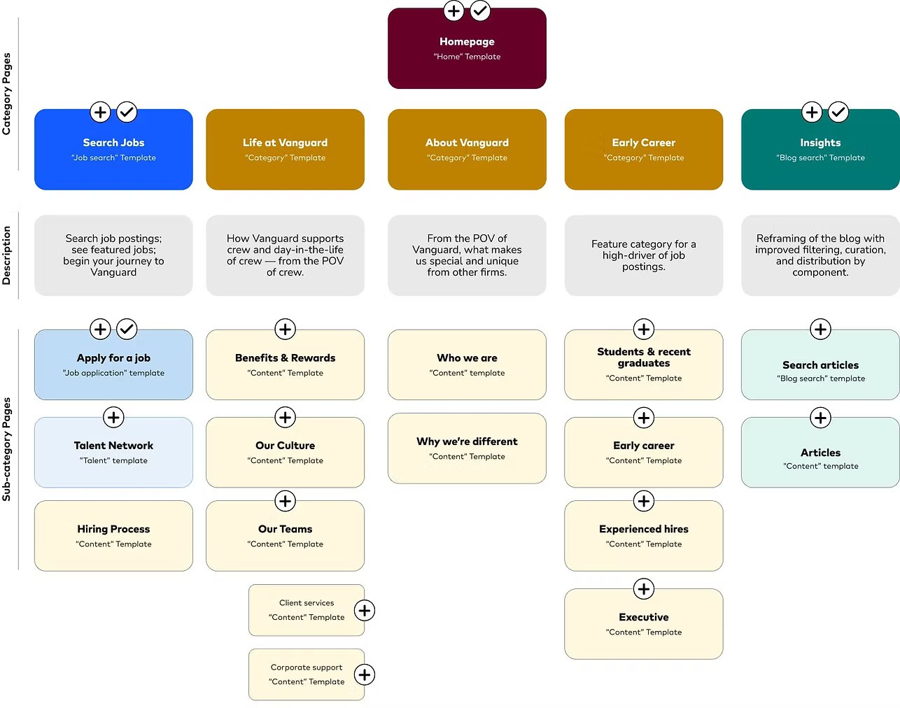
Career site Information Architecture
Wireframing
We designed wireframes for the three most-visited pages:
Homepage
Job search results
Job detail page
Each wireframe was shaped by:
Search and filtering improvements
Location/job-based discovery
Quick-apply features
Flexible content blocks
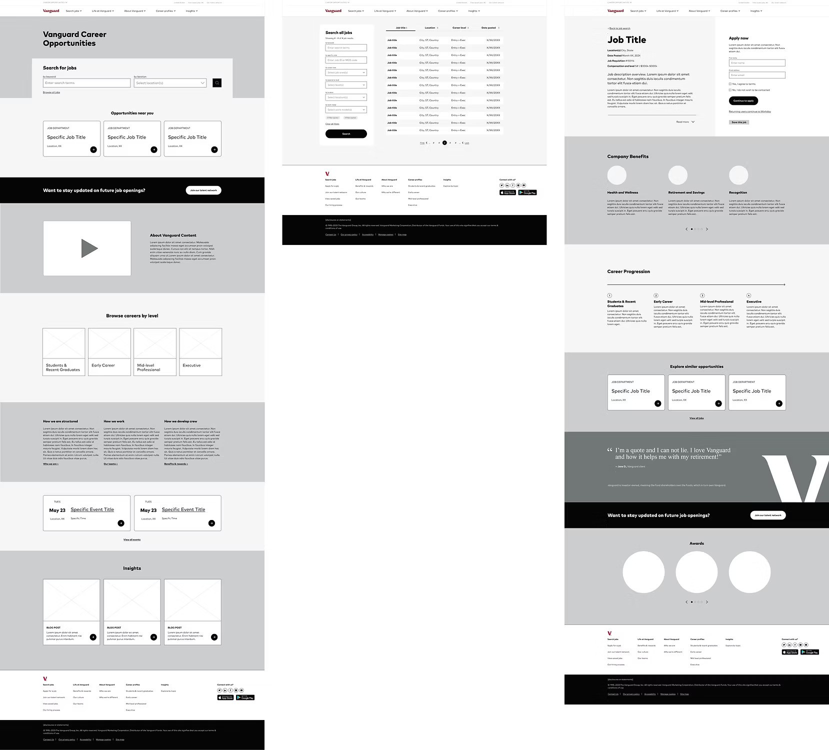
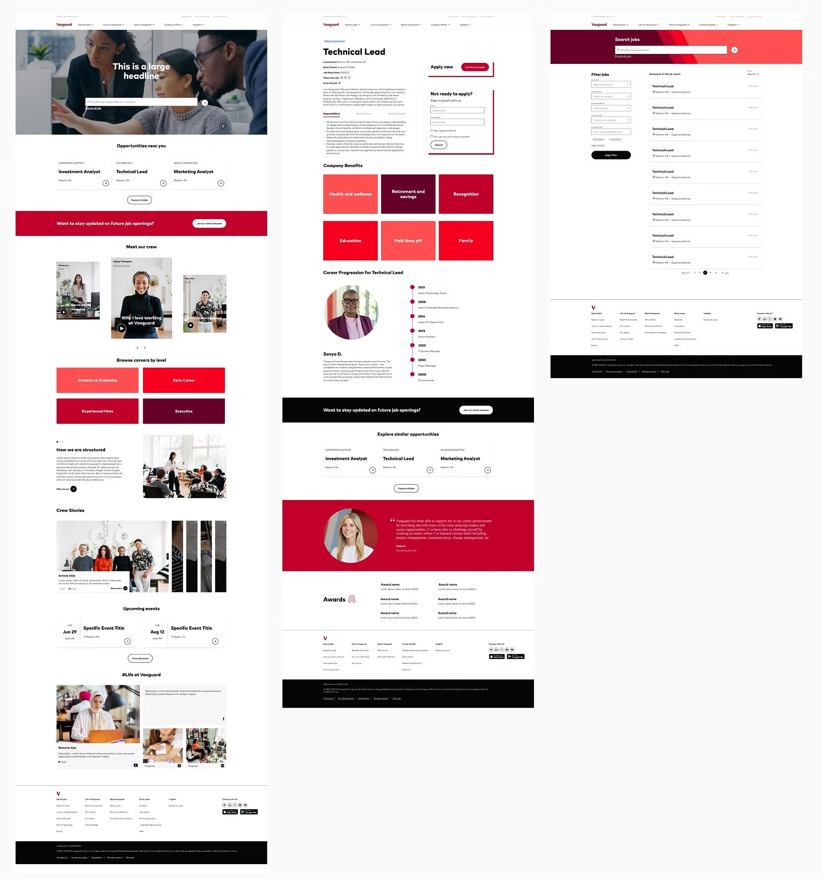
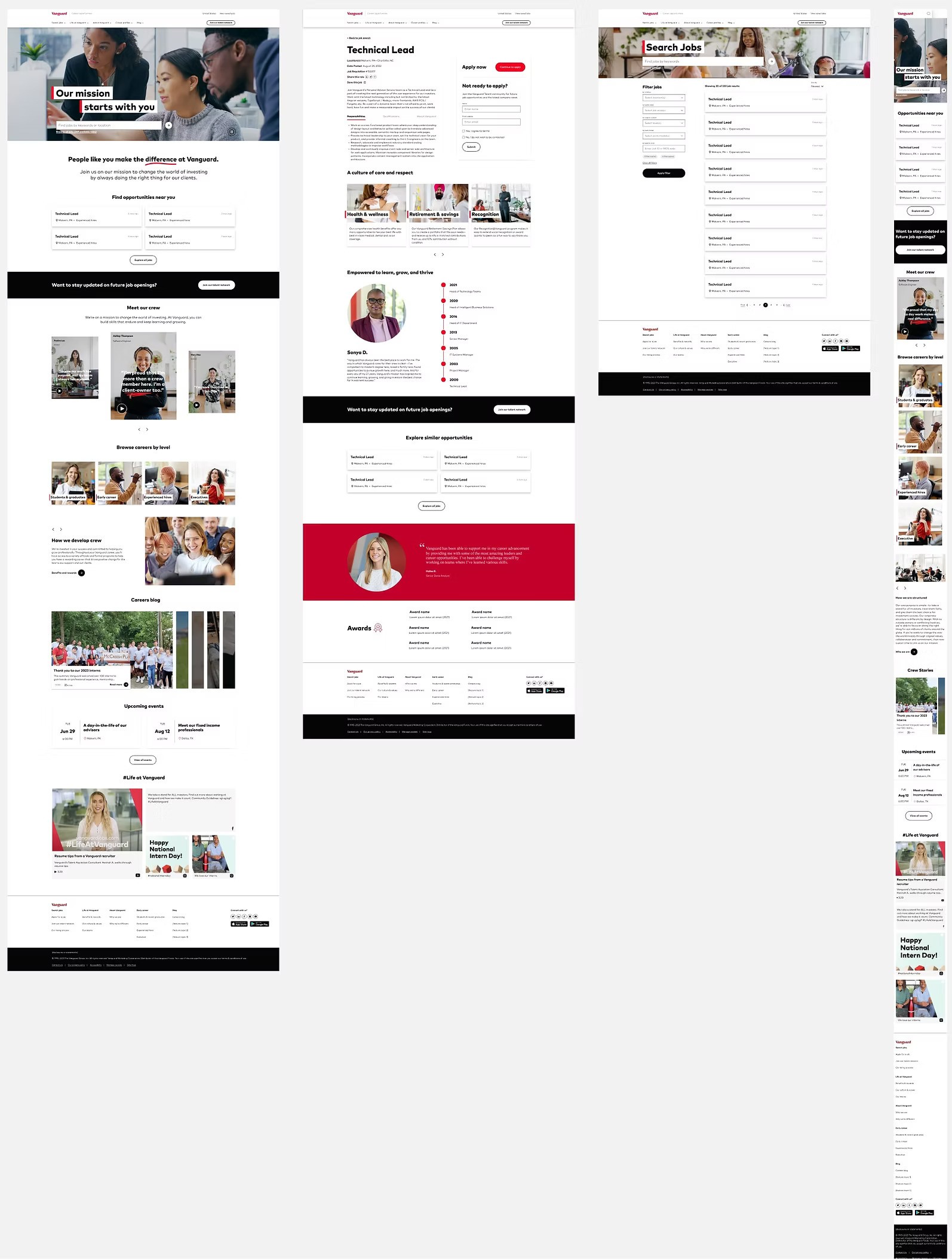
Wireframes for homepage, job search page, and job description page (left to right)
🧱 Design System Contribution
We created 31 responsive components, including
Hero banners
Search filters
Video modules
Quote cards
Timelines
Buttons, icons, and carousels
These components were documented for reuse by other internal teams.
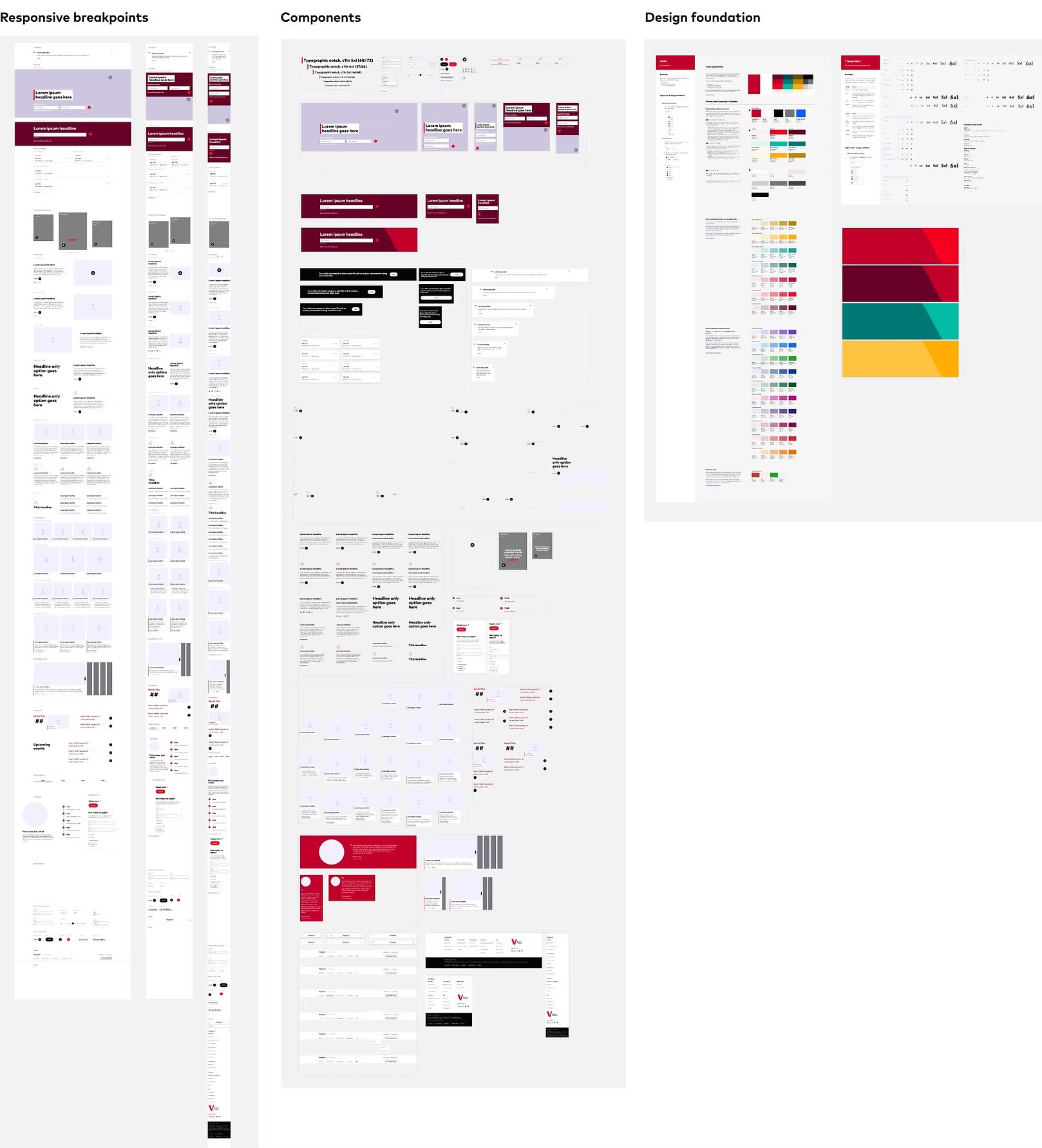
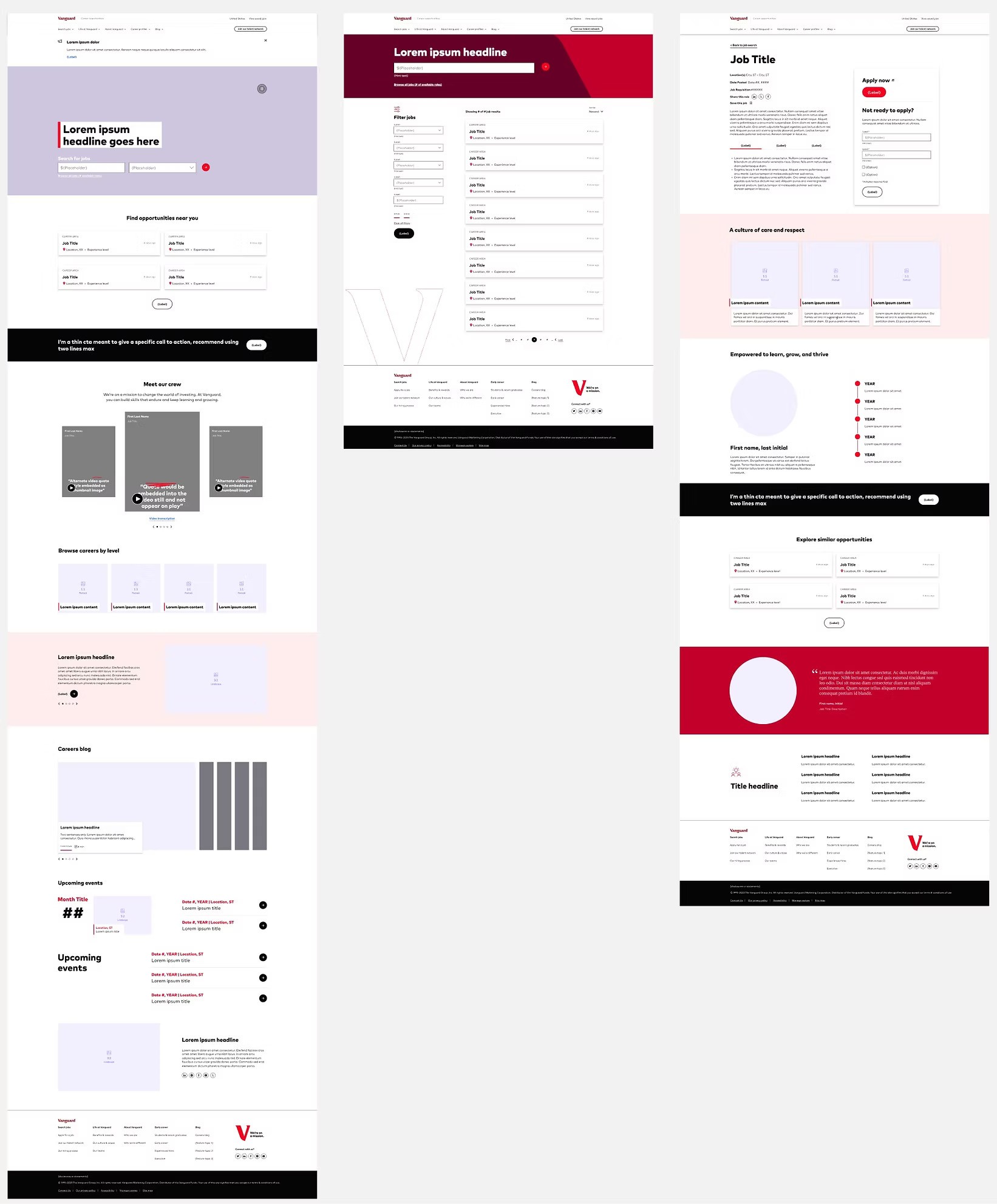
Inventory of new components. Considering responsive breakpoints and leveraging the Vanguard design system.
Safe vs. Bold UI Concepts
We designed two visual concepts to explore different directions.
🔸Concept 1—Safe
Clean and friendly
Exposed all info upfront
Used illustrations and soft visuals
Concept 1 wireframes for testing
🔸 Concept 2 – Bold
More immersive and dynamic
Focused on real images and candidate stories
Used hand-drawn accents and vibrant visuals
Concept 2 wireframes for testing
🔸 Re-imagining our global header
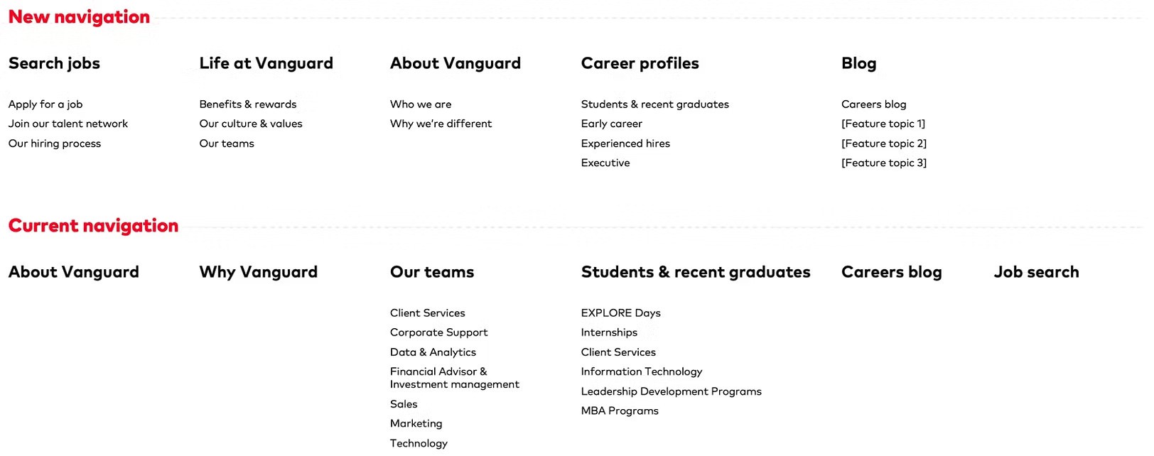
New navigation vs old navigation
🔬 User Testing & Findings
We tested both concepts with 120 participants, focusing on usability and engagement.
🔹 Homepage Insights
Video hero (bold) captured attention 10% more
2-filter job search (keyword + location) was 4% easier to use
Immersive stories with photos were 4% more engaging
🔹 Job Search Page
19% easier to search with a large top search bar
13% preferred card layouts over tables
Pops of color improved visual appeal (11% increase)
🔹 Job Detail Page
“Stay in touch” card was 19% less disruptive than modals
Grouping benefits was 17% more effective than listing individually
Larger quote visuals increased appeal by 10%
Real career stories were 6% more meaningful than generic info
🔁 Iteration & Alignment
After testing, we refined both concepts based on:
User insights
Internal feedback
Vanguard’s Employee Value Proposition (EVP) campaign
This included adding:
Hand-drawn elements
Red brand accents
Notches and visual motifs aligned with the EVP
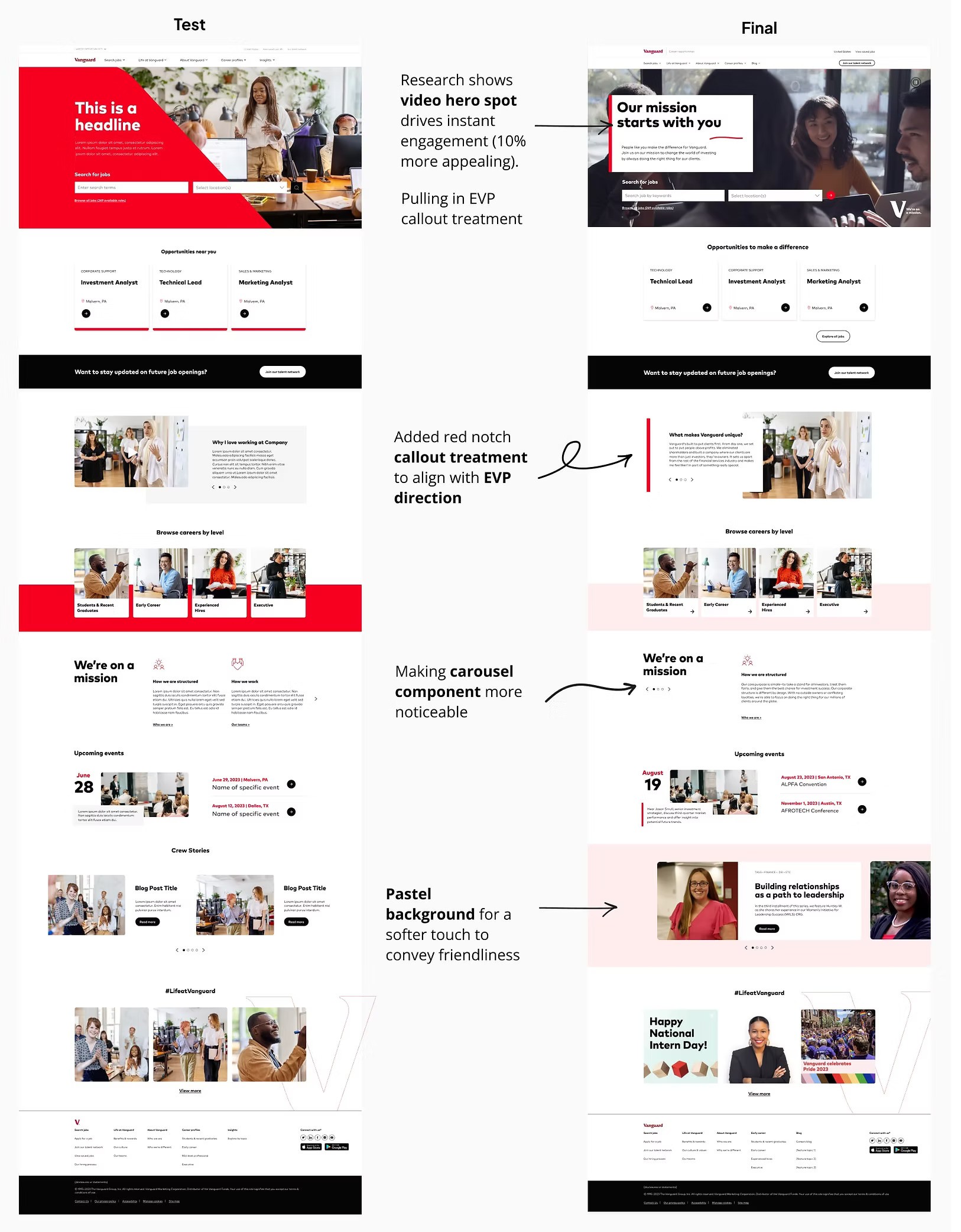
iteration of concept 1 homepage: test wireframe vs. final wireframe
🧩 Final Design Approach
Following the EVP adoption, we presented the 2 final concepts for stakeholder review.
Concept 1 final design
Concept 2 final design
🔗 Unifying the Concepts
After presenting both UI directions, we gathered stakeholder feedback and identified the most effective elements from each concept. Instead of choosing one direction, we merged the strongest parts into a unified final design.
This combined approach allowed us to:
Meet our full component needs
Align with both brand and campaign goals
Build a versatile design library for teams to create consistent pages across the site
🔄 What We Kept from Each Concept:
From Concept 1:
Event Cards – Clean, functional modules to promote key hiring moments
Illustration, Icon, and Type Teasers – Add personality and storytelling
2-Filter Search – Simple job search experience using keyword + location
From Concept 2:
Hero Spot Treatment – Bold visuals to grab attention and tell a story instantly
Video Component – Adds human depth and emotional connection
Card Layout – More engaging and digestible than tables
Career Progression Timeline – Visualizes real employee journeys
New Addition:
Social Component – A modular section that highlights community or culture posts, designed as an evergreen block (no live feed needed), making it sustainable for content teams.
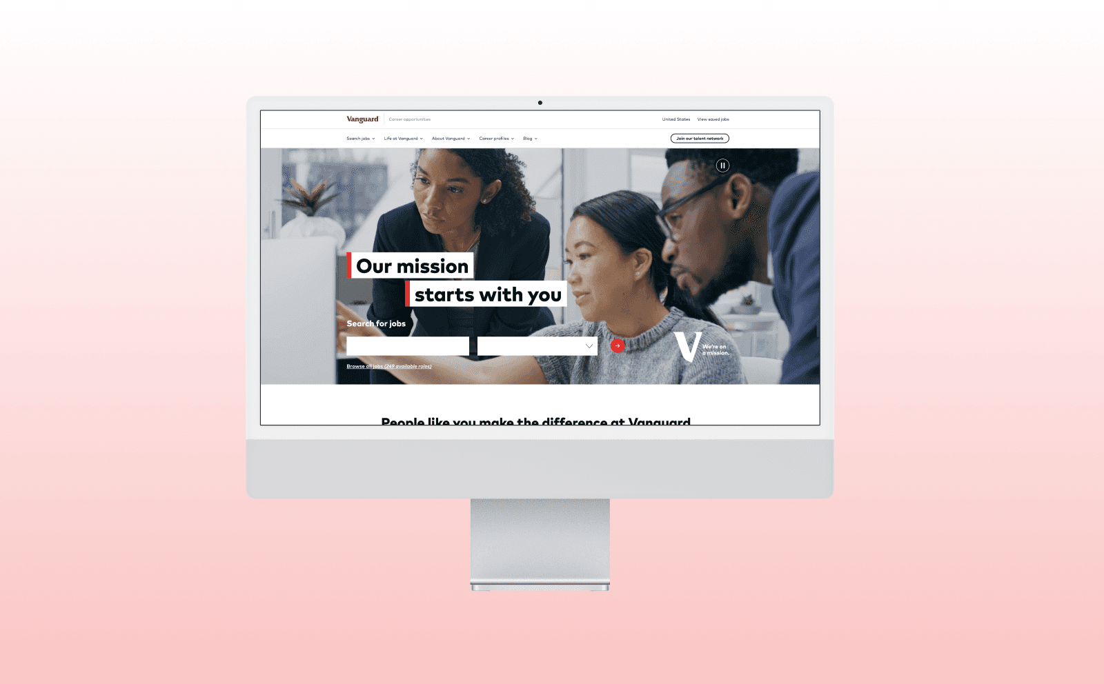
final Design
🧠 Learnings & Reflection
“This project challenged me to be flexible, collaborative, and thoughtful under real-world enterprise constraints.”
What I Learned:
Research leads design
Testing informs direction
Collaboration shapes outcomes
Systems scale impact
What I Gained:
Experience in large-scale collaboration
Quick thinking to solve “dark UX” issues
Stronger communication with stakeholders
Patience and persistence through delays and complexity