Mindcraft
Mindcraft
Mindcraft
Mindcraft
Project Summary
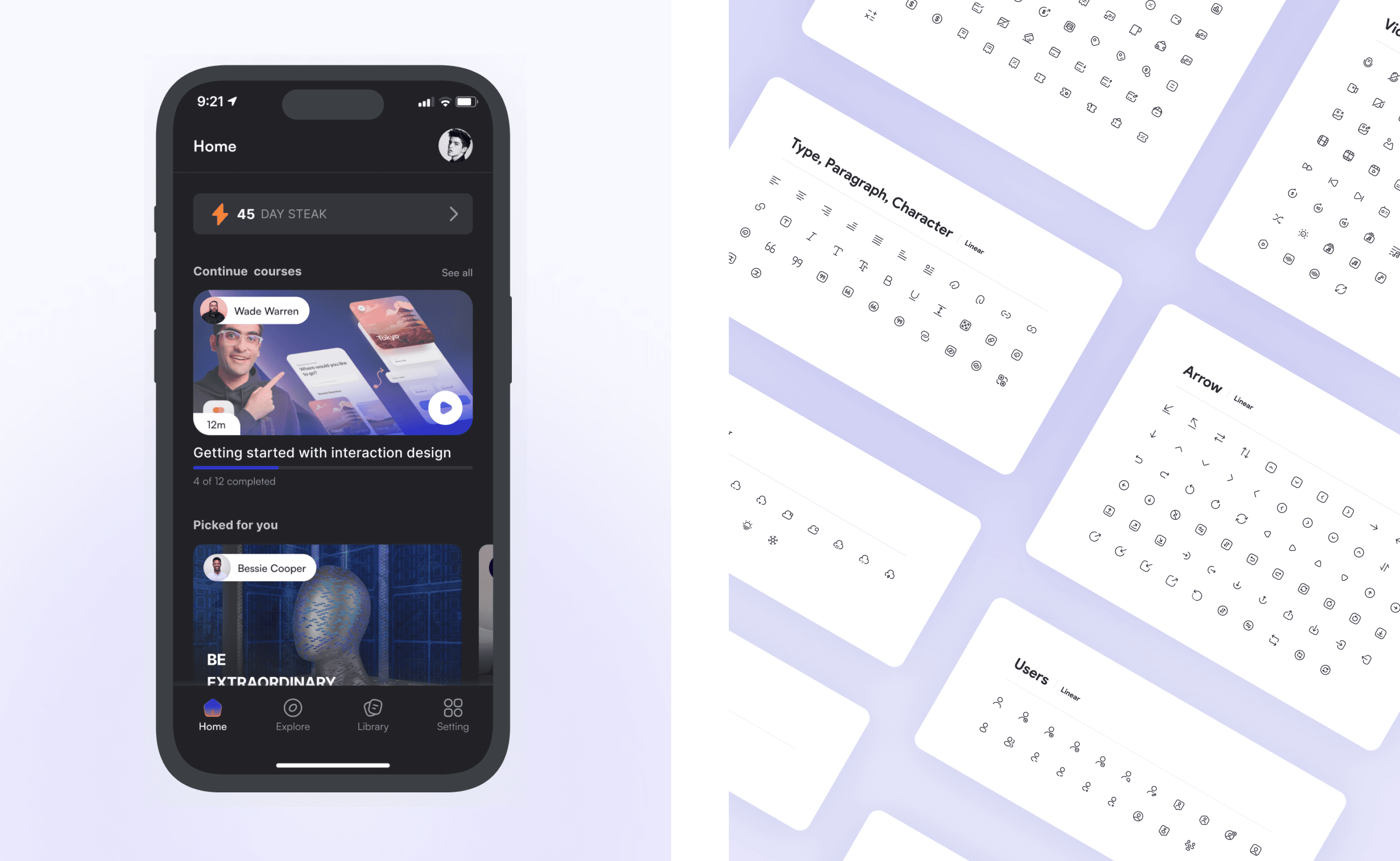
Mindcraft Mobile App is an innovative e-learning platform designed to bridge the gap between learners and quality education by leveraging technology and human-centered design. The platform is tailored for professionals, students, and lifelong learners who aim to upskill or reskill in their respective fields.
The product team comprised two UX/UI designers, including me, two IOS developers, one backend developer, and one project manager. The project started in December 2023 and is currently in the development process.
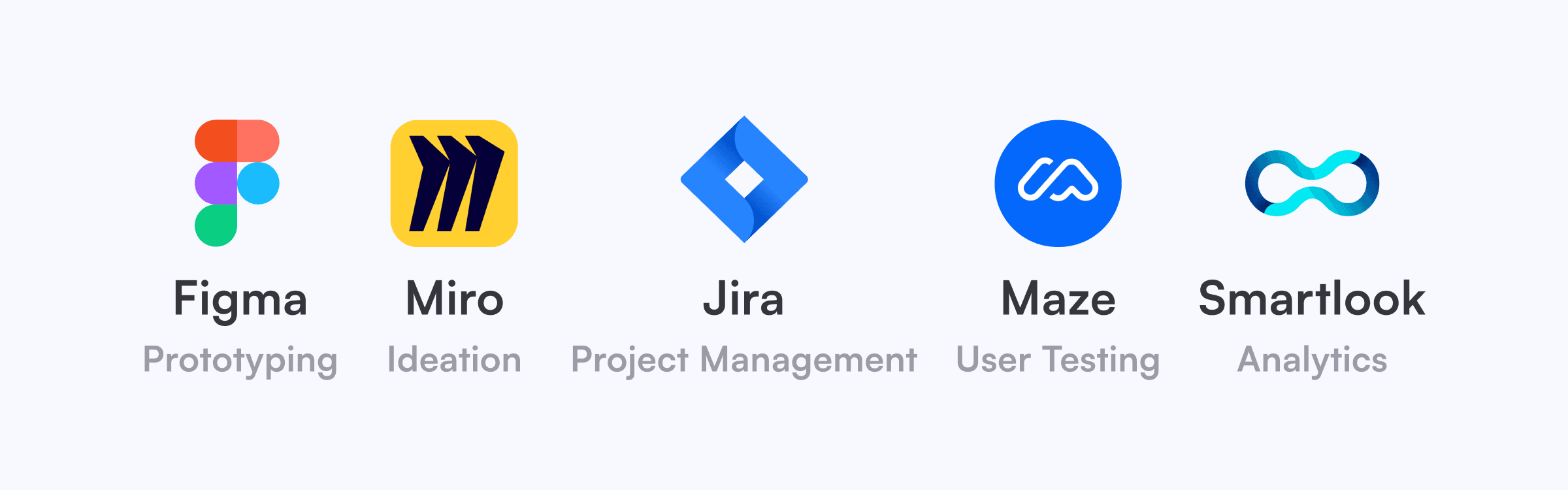
During the UX/UI design process for the Mindcraft Learning Mobile App, various tools were used to aid in collaboration, design creation, progress tracking, and user behavior analysis.
Problem Statement:
Fixing the Gaps in Online Learning UX
💡 The Problem
Many online learning platforms struggle with poor personalization, confusing navigation, and ineffective progress tracking. Learners often feel lost, unmotivated, and uncertain about their progress, leading to course abandonment rates as high as 70% (Source: EdTech Research 2023).
🎙️ What Users Say
We interviewed 20 learners from different backgrounds—working professionals, students, stay-at-home parents, and retirees. Here’s what we heard:
🗣️
“I struggle to stay motivated because I can’t track my learning progress clearly.”
🗣️
“I waste time searching for relevant courses. The recommendations are often irrelevant.”
🗣️
“Some platforms feel overwhelming. I just want an intuitive, easy-to-use app.”
🚀 The Opportunity
By prioritizing clarity, personalization, and intuitive navigation, we aimed to improve course completion rates and learning engagement for users.
Solution
A Personalized Learning Experience
User stories are central to defining the functionality of the Mindcraft mobile application. The following user stories are the top user goals they want to achieve based on user needs identified during interviews, existing personas, and the overall project direction, guide the platform's functionality.
Based on research, we designed a personalized Learning Experience with 3 core improvements:
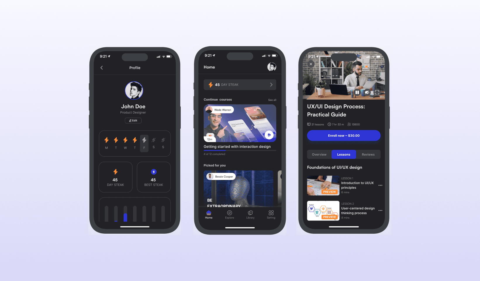
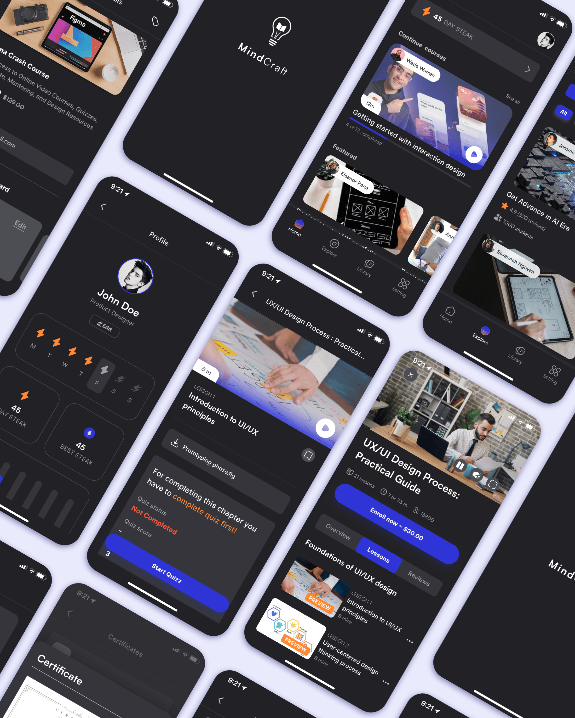
✅ 1. A Clear Learning Progress Tracker
Problem: 68% of learners we interviewed said they felt lost in their learning journey.
Solution: We designed a timeline-based progress tracker that:
• Shows estimated completion time for each lesson.
• Uses milestones and total streak to increase motivation.
• Provides personalized reminders for unfinished courses.
✅ 2. Smarter Course Recommendations
Problem: 75% of users struggled to find relevant courses.
Solution: We created an AI-powered recommendation engine that:
• Filters courses by skill level and career goals.
• Uses a short onboarding quiz to personalize the experience.
• Surfaces trending and top-rated courses based on user interests.
✅ 3. Intuitive Onboarding & Navigation
Problem: New learners often feel overwhelmed by too many choices.
Solution: We designed a streamlined onboarding experience that:
• Ask 3 simple questions to tailor content from the start.
• Uses a card-based interface for quick and easy course discovery.
• Highlights featured learning paths for guided progress.
Research:
Understanding User Needs & Pain Points
To validate these problems, we conducted 20 in-depth interviews and a survey with 50 respondents.
🔍 Key Insights from Research
📌 Pain Point 1:
68% of users struggled with unclear progress tracking.
📌 Pain Point 2:
75% of users found course discovery overwhelming.
📌 Pain Point 3:
55% of new learners felt existing platforms lacked beginner-friendly guidance.
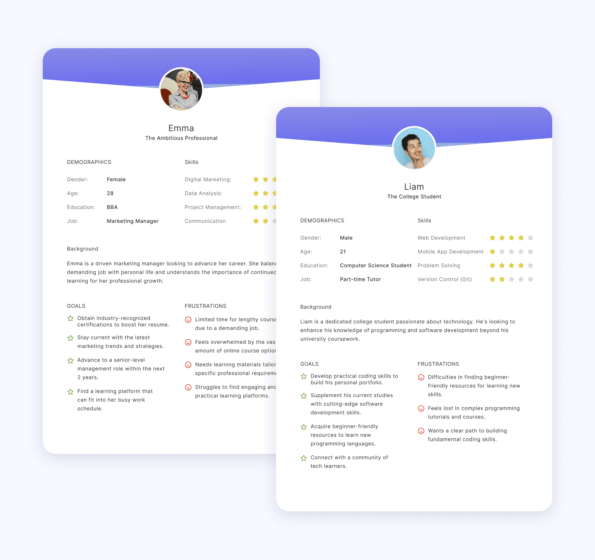
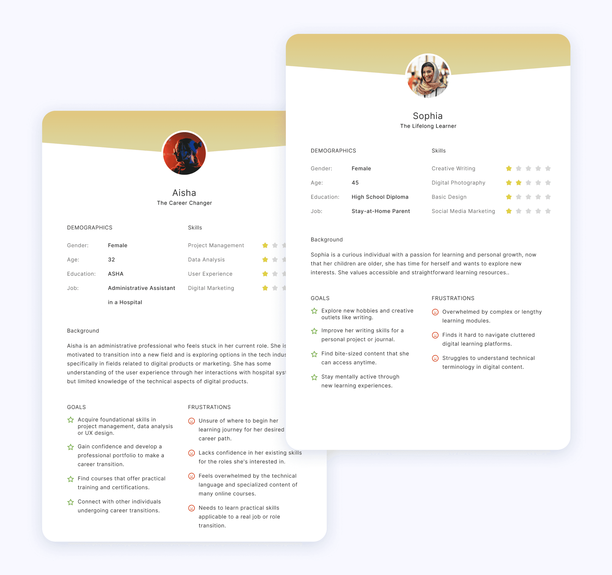
Using these insights, we created 4 user personas to represent different learning behaviors.
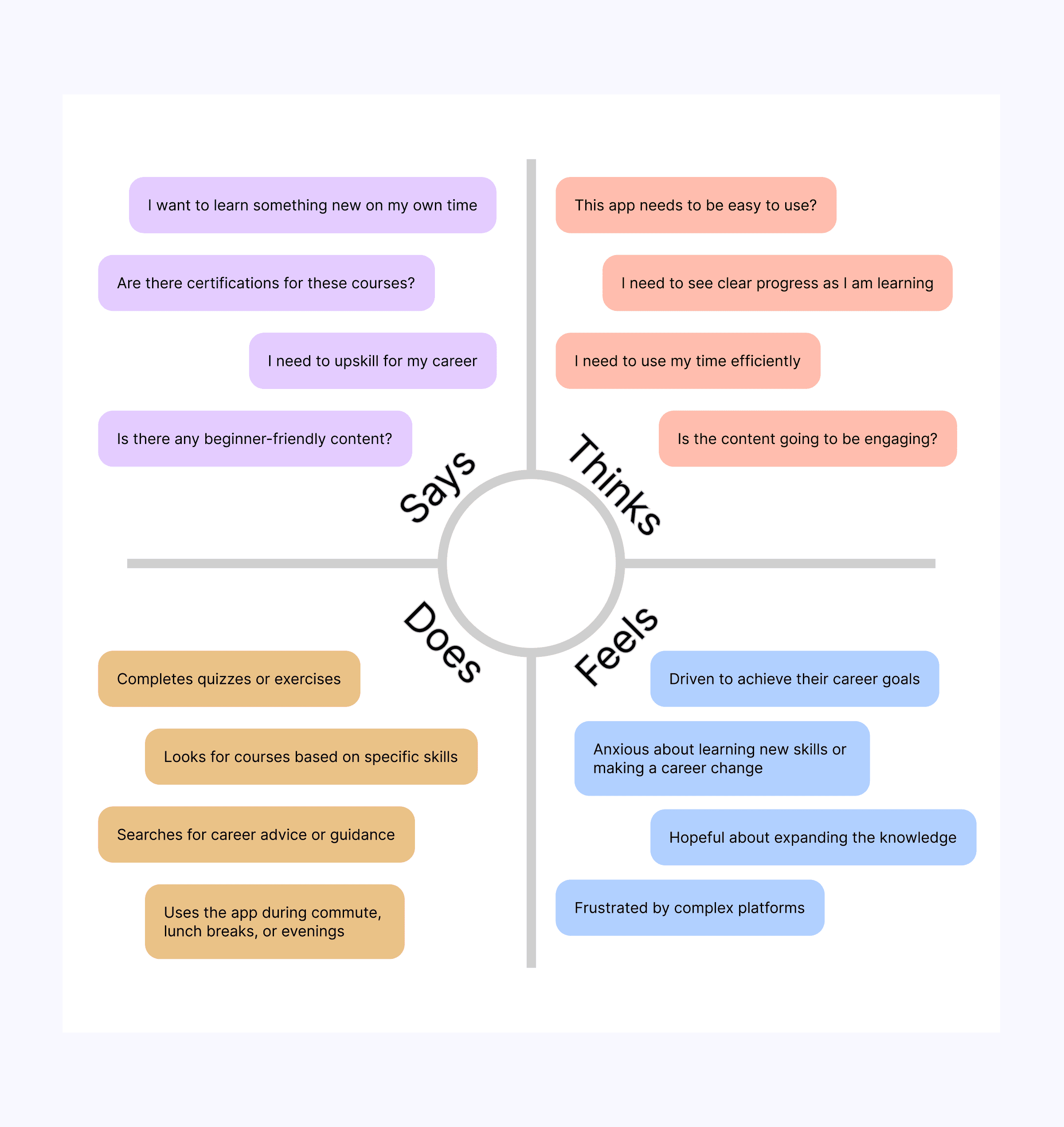
To sum up the findings from this point of view, we created the following empathy map describing what users say, think, feel, and do.
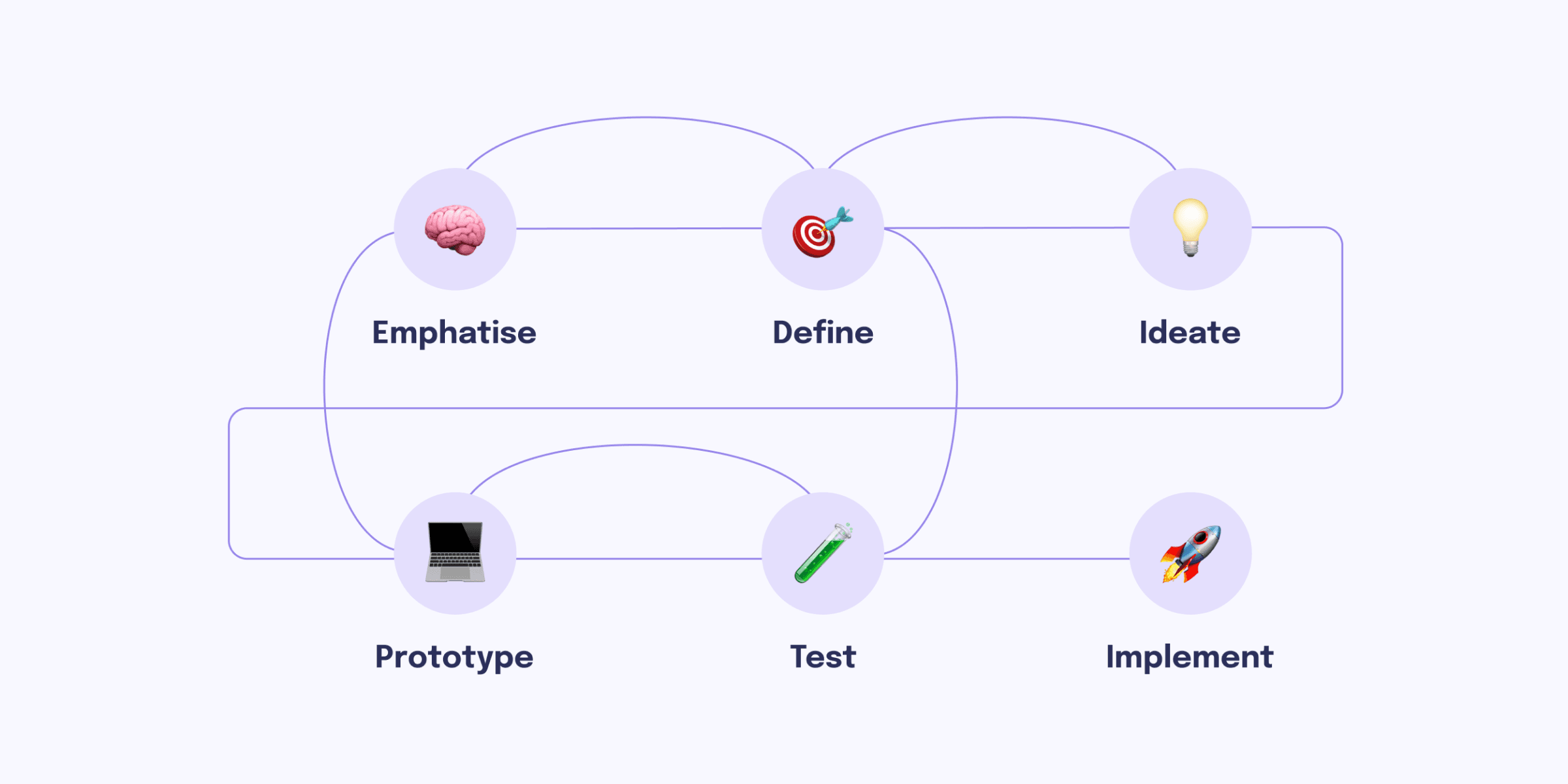
Design Process:
Iterative and User-Centered
We followed a design thinking approach:
1️⃣ Empathize: Conducted interviews and surveys.
2️⃣ Define: Identified key user pain points.
3️⃣ Ideate: Brainstormed solutions and created wireframes.
4️⃣ Prototype: Designed high-fidelity screens in Figma.
5️⃣ Test: Conducted usability testing via Maze.
6️⃣ Implement: App Implementation Stage.
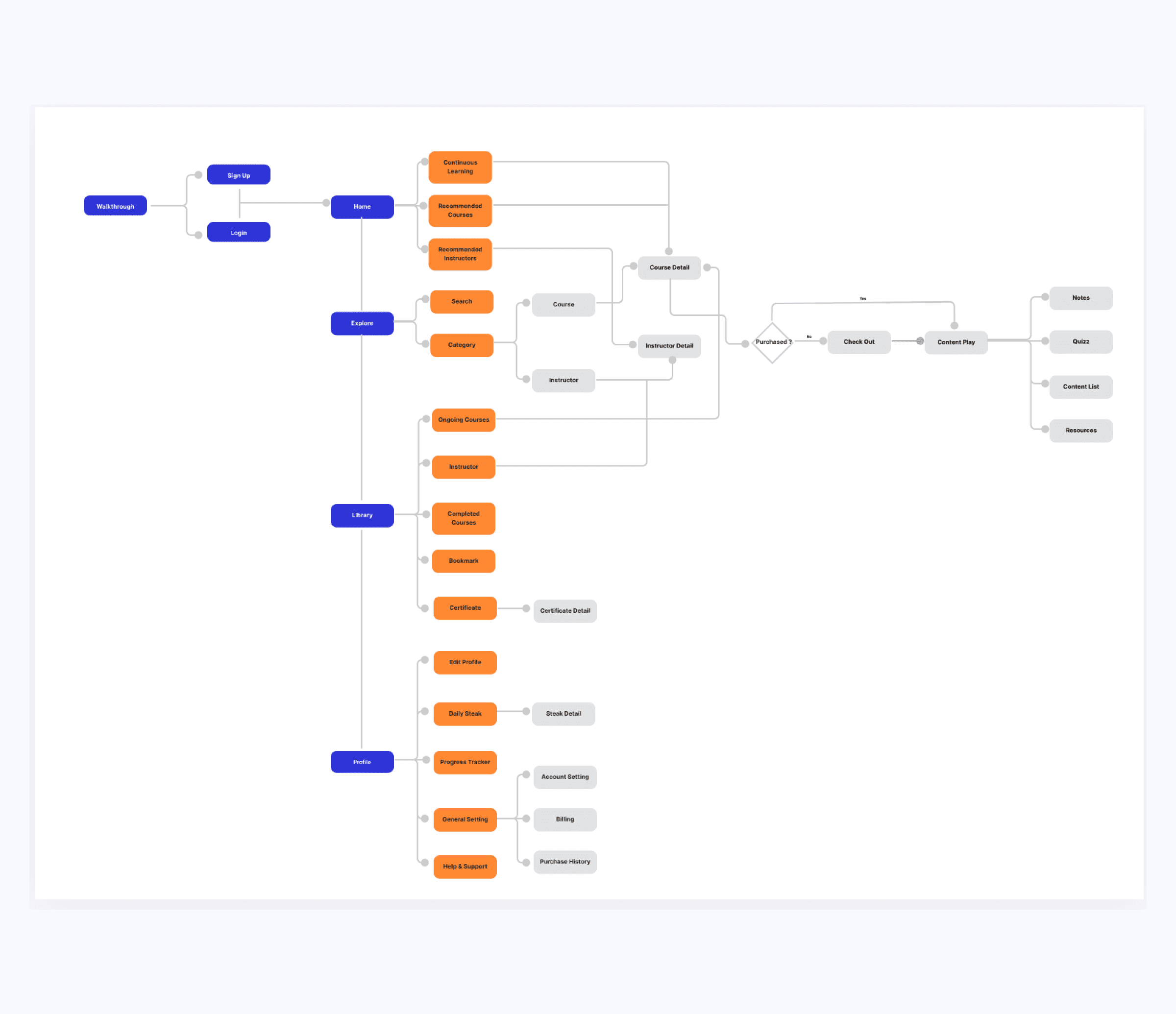
Information Architecture
Based on the user stories, we subsequently define the information architecture using the following sitemap.
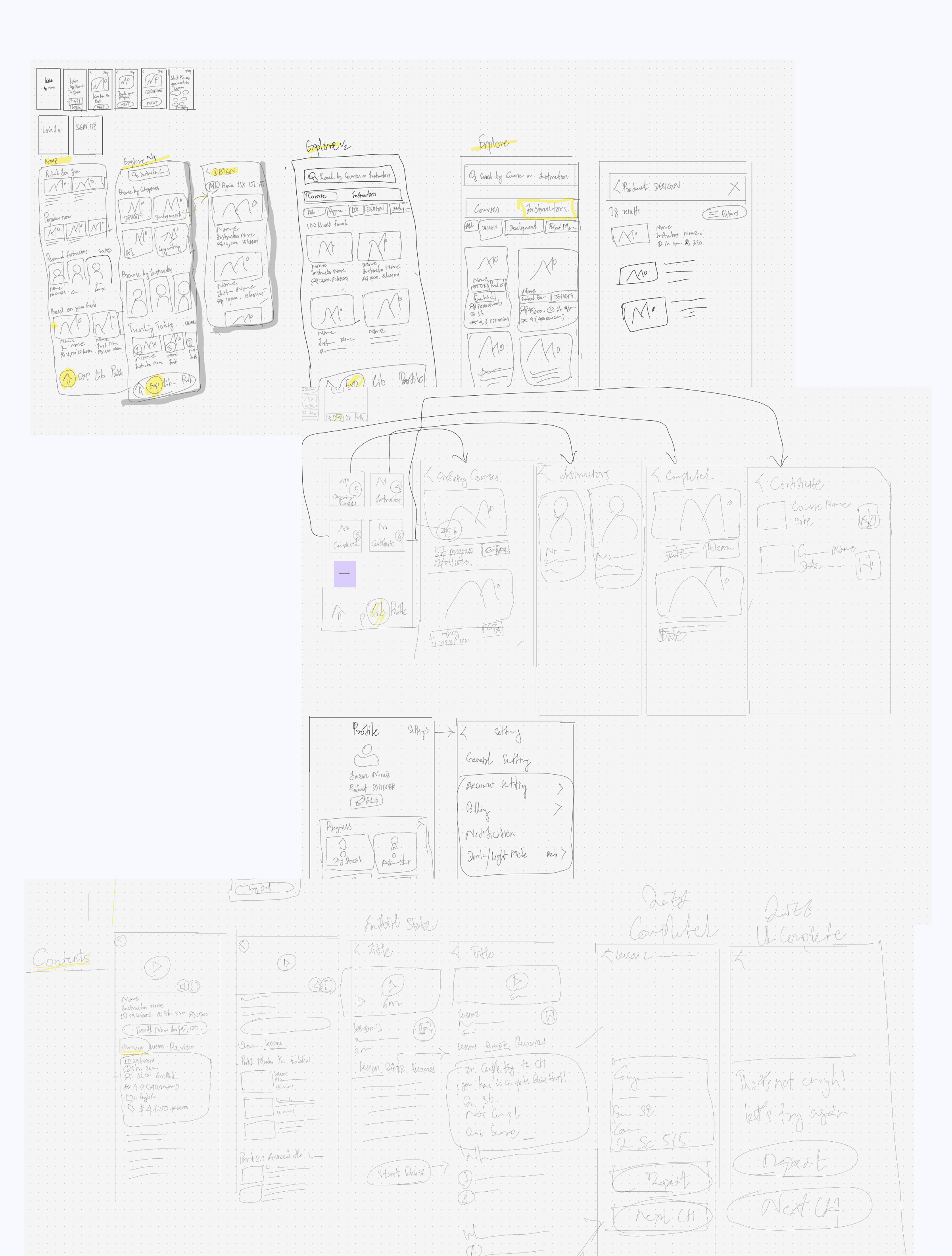
Wireframes
Following the information architecture, our goal was to explore visual design ideas and create visual prototypes, bridging the gap between initial concepts and the final polished product.
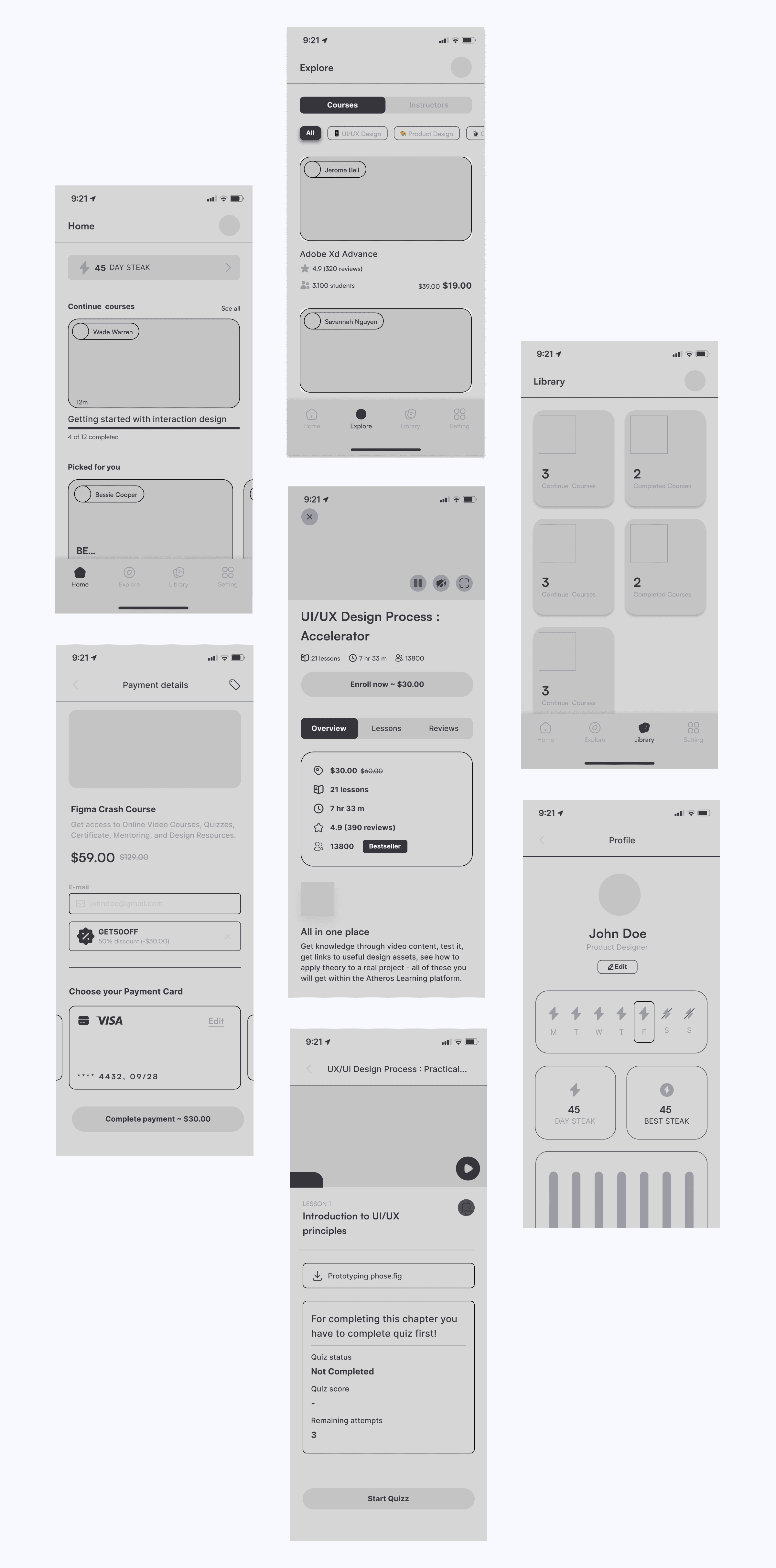
High-fidelity Design
The key outputs of our design process are high-fidelity prototypes and a comprehensive design system, all created in Figma. This tool allows seamless collaboration among designers, developers, project managers, and stakeholders.
Usability Testing
Validating the Solution
We conducted remote usability testing with 5 participants using a Figma prototype on mobile devices.
🔬 Key Findings from Testing
✅ 5/5 users successfully completed onboarding and found a relevant course in under 20 seconds.
✅ 4/5 users found the progress tracker helpful and motivating.
⚠️ 2/5 users struggled with finding advanced courses → Solution: We added a ‘Skill Level’ filter.
💡 Impact:
After making these refinements, our design improved ease of navigation compared to competitor platforms, reducing time-to-task by 35%.
Collaboration
Working with Developers & PMs
We worked closely with developers, PMs, and stakeholders to ensure smooth implementation.
📌 Key Collaboration Challenges & Solutions
🤝 Challenge:
The original design for the learning dashboard was too complex for mobile development.
✅ Solution:
We simplified animations and used lighter assets, reducing load time by 30%.
Final Outcomes & Impact
Although the product is still in development, our usability tests and early feedback show strong improvements in user engagement.
📊 Projected Outcomes (Once Live)
🚀 Expected 20-30% increase in course completion rates.
🚀 Faster course discovery → Navigation time reduced by 35%.
🚀 Higher engagement → More users completing learning milestones.
Reflection & Lessons Learned
🌟 What Worked Well
✅ User research directly influenced feature decisions.
✅ Personalization improved engagement.
✅ Usability testing provided valuable insights for iteration.
💡 What Could Be Improved?
⚠️ Earlier collaboration with developers could have prevented UI performance issues.
⚠️ More A/B testing needed to refine the recommendation algorithm.
🚀 Future Improvements
🔹 Implement AI-powered course recommendations for better personalization.
🔹 Add progress tracking gamification (leaderboards, challenges).
Conclusion
Key Takeaways
Mindcraft is a user-centered learning platform that solves key UX challenges in e-learning. Through data-driven insights, iterative design, and usability testing, we created an intuitive, engaging, and effective experience.
🚀 Final Impact:
✅ Personalized learning paths → More relevant courses.
✅ Improved navigation → Faster course discovery.
✅ Clearer progress tracking → Increased motivation and retention.
💡 Next Steps:
• Conduct post-launch analytics to measure real-world impact.
• Continue iterating based on user feedback.